Travel Agent
case study
for website
Click the buttons on the
left to Navigate through
this case study

Product Overview
The Product:
Gem Travels' website creates a smooth submission flow for users to rate their travel experience. Gem Travel aims to target customers who have planned their trips with the company but are unaware of how to leave a review of their experience.
Project duration:
January 2023 to February 2023
My role:
UX designer, designing a website for Gem Travel from conception to delivery.
Responsibilities:
Conducting interviews, paper and digital wireframing, low and high-fidelity prototyping, conducting usability studies, accounting for accessibility, and iterating on designs.
Platform:
Adobe XD
How might we improve the amount of time a user takes to make a review of the travel agent on the website, to encourage more users to review their travel experiences?
The problem:
Busy schedules, especially for professionals or students, might limit the time users have to dedicate to writing a detailed review.
The goal:
Design a submission flow for a website for the travel agency, Gem Travel, that grants users the ability to easily submit a review of their travel experience.
Impact
My project 'Gem Travel' is expected to lead to a projected increase in first time user achievement metrics by 35%. Through an iterative design approach, incorporating both paper and digital wireframes, we achieved a more efficient design process, saving significant time and resources. Leading the end-to-end design using Adobe XD, I ensured a cohesive and effective user experience, enhancing the submission flow for travel agent reviews based on detailed iterations and user feedback. Moreover, through my leadership in design sprints, jam sessions, and design reviews involving quality assurance, we ensured that all design goals and objectives were aligned. This concerted effort is expected to drive a substantial decrease in user error rates by over 10%, enhancing the overall usability and effectiveness of the travel agent review platform.
Dive deeper into the case study to explore the intricate design details and methodologies that drove these transformative changes.
Understanding the user
User research: Summary
I administered competitive audits, interviews, empathy maps, and analyzed user studies to gain a better understanding of user needs. The predominant users identified throughout the research were adults who were too busy to verify the best travel agent to plan their trip and review their trip experience.
This group of users validated the initial beliefs about Gem Travel customers, but upon more research, it was made aware that time was not the only factor limiting users from planning their own trips. Some user problems included challenges that can make it hard to plan trips on their own or review other travel agents online quickly.
User research: Pain Points
1.
Time
Adults are too busy to spend time searching for customer reviews.
2.
Authentification
A simple design layout that is organized to improve app usability, can help users verify if the company is trustworthy quickly.
3.
Accessibility
Not including more languages to translate the text on the platform makes it hard for users who understand different languages to use.
Persona: Sandra
Problem statement:
Sandra is a busy business woman who needs an authorized travel agent with positive past experiences because they want an amazing travel agent to help book a wonderful vacation since they do not have the logistics to plan a trip.
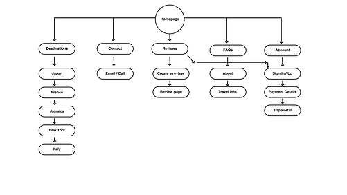
Site Map
Paper Wireframes
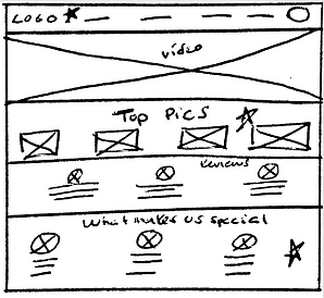
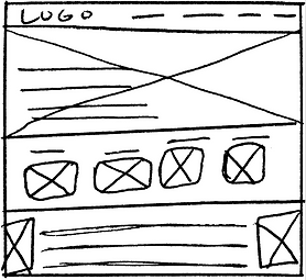
Drafting multiple iterations of each screen on paper, made sure that each element that was implemented onto the digital wireframes were created to help solve user pain points while using the app. For instance, on the home screen, I made sure to include multiple ways to navigate through the app smoothly.
A navigation
bar that is
consistent
within the
website helps users
navigate through the
website.


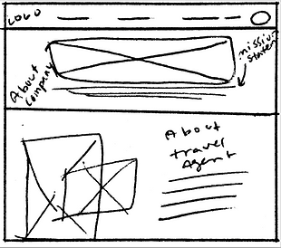
Including text next to an image helps diversify the
information
architecture.
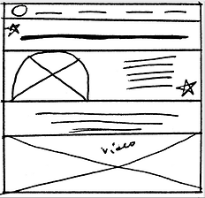
Stars were used to mark the elements of each sketch that would be used in the initial digital wireframes.
Digital wireframes
When initiating the design process, I began to create the website designs based on user feedback to help advance the users flow. Which was also backed up through user research.
Including easy navigation was an important thing to include in the design of the website along with making sure it is compatible with accessible technologies such as screen readers.
Low-fidelity Prototype
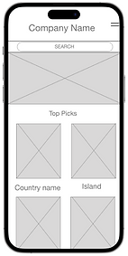
The low-fidelity prototype demonstrates the main user flow that a user may have when trying to submit a review of their experience using a travel agent. This was created so that users could test its functionality in a usability study.

Low-FidelityPrototype
Screen size variations
Usability study: findings
I conducted two rounds of usability studies. What was discovered from the first usability study was used to help influence the designs from wireframes to mockups. The second study used a high-fidelity prototype and showed what specific parts of the mockups needed to be corrected.
Round 1 findings
-
Users wants to submit reviews for their experience with a travel agent quickly
-
Users wants to easily find an authentic travel agent with positive reviews
-
Users want back and forth page navigation to easily complete a task
Round 2 findings
-
Users want a confirmation page after a task is successfully completed
-
Users want more filters added for users to specify their searches
-
Users would benefit from the removal of text on top of a video to increase readability
Usability study parameters
1.
Study type:
2.
Moderated usability study
Location:
United States, Remote
3.
Participants:
Length:
4.
5 Participants
3 women and 2 men between the ages 22 - 45
50 minutes
Sample Questions:
Can you please sign in to the Gem Travel website? After you sign in, can you submit a review for a travel location?
Prompt 1 follow-up: How easy was it to find the sign in page? What made submitting a review easy? Is there anything you found challenging when completing this task?
Refining the design
Mockups
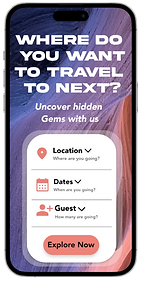
When starting the design phase, I began to create freely, but after conducting the first usability study, I reduced the size of the company name and moved it to the top of the website. I also revised the the design of the homepage to allow users to plan their trip quickly.
After the second usability study, users displayed annoyance with not being able to navigate back and forth though the submission review process. I also included arrows to inform users to scroll down within the website to complete the next task in the submission flow.
High-fidelity prototype
The final high-fidelity prototype showed a smooth and user flow for finding an authentic travel agent and being able to plan a trip and submit a review.
View the Gem Travel Website:
High-Fidelity Website Prototype

Mockups
Screen size variations
Accessibility considerations
1.
Provided labels within text place holders to help users with screen readers easily navigate through the website.
2.
Included color schemes that easily allowed users to read text throughout the website. I made sure to not colors that are often hard to differentiate between with color blindness.
Used simple wording and big text, so users are easily able to see and read all of the necessary information on the website.
3.
Going forward
Impact:
The website, Gem Travel, reinforces to users that their wants and needs are always considered.
What I learned:
While designing the website, Gem Travel, I learned that creating multiple interactions of a design can help introduce new ways to solve users pain points. Even after designing the website, usability studies and peer feedback help correct more pain points to increase user flow.
One quote from peer feedback:
" The website for the travel agency, Gem Travel, makes it so easy to see if that travel agent is legit. I also like that I can see reviews from past customers and make my own review quickly after going on a trip.”
Next steps
1.
Reflect on user feedback for iterative improvements.
2.
Conduct more user research to determine any new areas of need. Then, document key learnings for future projects.
3.
Engage in knowledge-sharing sessions to discuss new insights and priorities for improvement.


