Flower Shop
case study
for MObile app
Click the buttons on the
left to Navigate through
this case study
Product Overview
The Product:
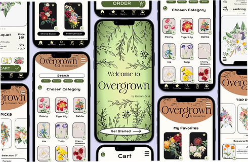
Overgrown is an app that aims to provide customers with fresh and custom floral arrangements for every occasion. Overgrown offers a wide variety of prices to cater to every customer's needs. Overgrown targets customers from all backgrounds, who lack the time and ability to pick out their desired floral arrangements.
My role:
Responsibilities:
UX designer, designing an app for Overgrown from conception to delivery.
Conducting interviews, paper and digital wireframing, low and high-fidelity prototyping, conducting usability studies, accounting for accessibility, and iterating on designs.
Project duration:
December 2022 - January 2023
Platform:
Figma
How might we design a user-friendly mobile app that allows users to browse, select and purchase flowers from a flower shop with ease?
The problem:
A lengthy or convoluted checkout process with multiple steps lead to busy workers and students frustrated when trying to purchase the flowers they want.
The goal:
Design an app for Overgrown, that allows users to easily find and purchase the flowers they need.
Impact
My project 'Overgrown', focused on creating an intuitive and adaptable mobile-centered platform. Utilizing Figma and Adobe Creative Suite, I crafted wireframes and interactive prototypes, enhancing design quality with typography and design principles. I was guided by comprehensive user research, such as competitive audits and user journey maps. The mobile-first approach boosted end-to-end success rates by 40% within our flower shop app. Establishing a design system ensured consistency, projecting a 50% increase in first-time user achievement. Iterating during design sprints, led to an estimated 15% decrease in user error rates, enhancing overall usability. This strategic blend of design innovation and data-driven methodologies aims not just for user satisfaction but to revolutionize the mobile flower shop experience.
Dive deeper into the case study to delve into the detailed design specifics and approaches that drove these impactful transformations.
Understanding the user
User research: Summary
I conducted user interviews and created empathy maps to help understand the needs of the users I would be designing for. The main user group that was identified through research were working adults who did not have time go buy flowers.
This user group confirmed initial assumptions about Overgrown customers, but research also showed that time was not the only factor limiting users from buying the flowers they wanted. Other users faced problems including obligations, interests, or challenges that make it difficult to find fresh flowers or find the best floral arrangement in-person.
User research: Pain Points
1.
Time
Working adults are too busy to spend time searching for the best flowers to purchase.
2.
Organization
A simple design layout that is organized to improve app usability, can help users make their purchases quickly.
3.
Accessibility
Platforms for ordering food are not equipped with assistive technologies.
Nor do they accommodate users who speak different languages.
Persona: Areeta
Problem statement:
Areeta is a full-time history teacher who needs an organized app that easily shows flowers with specials and for different occasions because they want to find the best flowers at the best price and do not have time in their busy schedule to go in-store and search for the best flower prices.
User flow Journey

Competitive Audit
Paper Wireframes
Drafting multiple iterations of each screen on paper, made sure that each element that was implemented onto the digital wireframes were created to help solve user pain points while using the app. For instance, on the home screen, I made sure to include multiple ways to navigate through the app smoothly.

Providing images above each text helps users preview a topic before they
determine which item they would pick


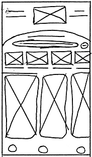
Including a search bar allows users to find what they are looking for throughout the site. Keywords were also included to help users narrow down their searches.

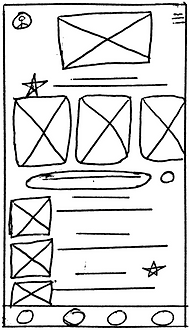
Stars were used to mark the elements of each sketch that would be used in the initial digital wireframes.
Digital wireframes
As the design phase began, I started to create the app designs based upon user feedback to help improve the users flow. Which was also backed by user research.
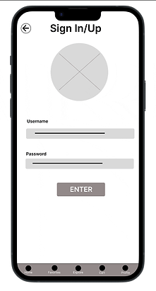
Easy navigation throughout the app was the main focus when creating the digital wireframes for this app. To make sure users have a quick and easy process when purchasing a product. Each button vibrates to help alert users on what they are clicking on the app.
Low-fidelity Prototype
The low-fidelity prototype exemplifies the main user flow one may have when finding and purchasing flowers. Which will be tested in a usability study with users.
View the Overgrown, Flower Shop App
Usability study: findings
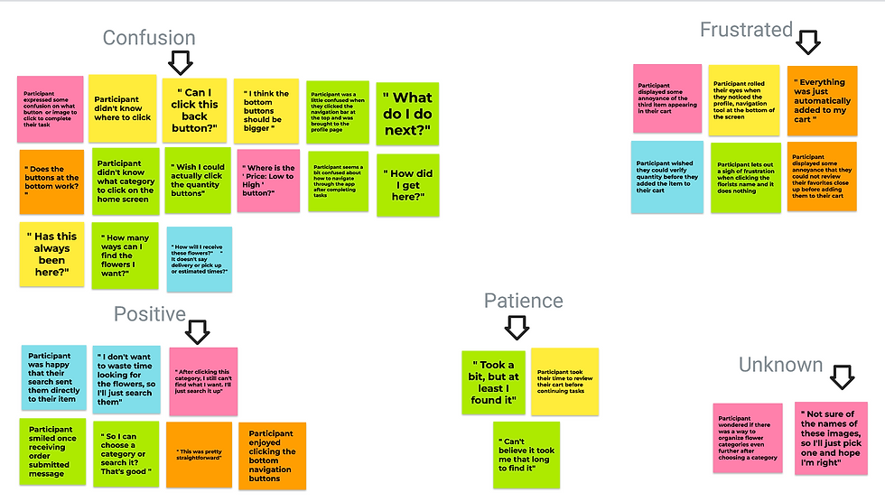
I conducted two rounds of usability studies. The findings from my first study helped guide the designs from the wireframes to the mockups. The second study used a high-fidelity prototype and revealed what aspects of the mockups needed refining.
Round 1 findings
-
Users wants to purchase flowers quickly
-
Users wants to easily navigate through the app to find the flowers they want
-
Users wants a delivery and pick up option
Round 2 findings
-
Users would benefit from more languages should be added
-
Users want more refining tools added for searching within the app
Usability study parameters
1.
Study type:
Location:
2.
Moderated usability study
United States, Remote
3.
Participants:
Length:
4.
5 Participants
2 women, 2 men, and 1 non-binary person
between the ages 16 - 42
45 minutes
Sample Questions:
For the second task, can you complete a purchase of an item from your favorites?
Prompt 2 follow-up: How did you feel when going from the explore page to the profile information page? What challenges did you face when navigating through the app? Was there anything you liked when completing this task?
Affinity Diagrams

Describe your image
Describe your image

Describe your image
Refining the design
Mockups
Early in the design process, I began to add my own customizations to the app. After conducting usability studies, I decided to remove the images above the categories to remove confusion on where to start navigation within the app. I also removed the category descriptions to retain a simple design that is easy to navigate.
After the second usability study, I decided to include a quantity section so users can choose how much they want to add to their cart. I also revised the design a little, so users can add an item to their favorites page. As well as, adding borders and lines to help create space and help users separate content.
High-fidelity prototype
The final high-fidelity prototype showed a cleaner user flow for finding and purchasing flowers. This prototype also met user needs for a delivery and pickup option.
View the Overgrown App
Design System
Why did I choose these font, colors, and illustrations?
In developing Overgrown, I curated a design language that reflects the essence of nature and evokes feelings of freshness and warmth. The color palette, featuring shades of green, black, tan, and yellow, was carefully selected to embody the vibrancy and diversity of botanical life. Green, the primary color, symbolizes growth and vitality, while black and tan provide a sophisticated contrast, grounding the design with a sense of elegance and refinement. The addition of yellow accents infuses the interface with energy and optimism, reminiscent of the sun's radiant glow. To complement these colors, we opted for illustrations over photo images to convey a whimsical and artistic aesthetic. Custom illustrations of various flowers, foliage, and botanical elements were carefully chosen, adding a playful yet authentic touch to the app's visual identity. By seamlessly integrating color, typography, and illustrations, we created an immersive user experience that invites users to explore the beauty of nature and discover the perfect bouquet for any occasion.
Sticker Sheet
Accessibility considerations
1.
While creating the design for this app, I wanted to make sure language would not be a barrier for users wanting to purchase flower. Which is why I included a translation tab within the search bar.
2.
I created a lot of text within the apps base designs. To make sure users using a screen reader can easily navigate through this app.
While creating the interactions between different buttons and pages, I made sure to create multiple interaction lines for each button. I also created big buttons to click, so no matter where the user clicks on the button, it will help them navigate through the app.
3.
Going forward
Impact:
The app, Overgrown, affirms to users that it thinks about their needs and how to meet them.
What I learned:
While designing the Overgrown app, I learned that the first ideas for the app are only the beginning of the process. Usability studies and peer feedback influenced each iteration of the app's designs.
One quote from peer feedback:
" I like the variety of flowers shown on this app. You get to view more flowers at a quicker pace. I can see myself using this app when I don’t know what kind of flowers to get. Also, when I don’t want to go in a store.”
Next steps
1.
Conduct another round of usability studies to validate whether the pain points users experienced have been effectively addressed. Conduct another round of usability studies to validate whether the
pain points users experienced have
been effectively addressed.
2.
Conduct more user research to determine any new areas of need.
3.
Iterate and adjust new designs within the app to help improve the user pain points, to create better app usability.


