Voter
Registration
case study
for website and app
Click the buttons on the
left to Navigate through
this case study

Product Overview
The Product:
Unifye is an Atlanta-based organization focused on voter registration. Unifye is a tool catered to help people register to voter in a quick, simple, and smooth process. Unifyes’ main target users include young adults and new U.S. citizens who are concerned about the the process and time it takes to register to vote.
Project duration:
February 2023 - March 2023
My role:
UX/UI designer leading the app and responsive
website design from conception to delivery
Responsibilities:
Conducting interviews, paper
and digital wireframing, low and high-fidelity prototyping, conducting usability studies, accounting for accessibility, iterating on designs, determining information architecture, and responsive design.
Platform:
Figma
How might we simplify the registration process on the website to increase completion rates and reduce barriers to voter participation?
The problem:
During the 2020 presidential election, the voter turnout for ages 18-24 was only 51.4%. Unifyes’ strategy team has noticed a disinterest in voting in political elections and uncertainty about starting the voter registration process.
The goal:
Design an app that will improve voter registration amongst young adults and help people manage their registration accounts. Creating both mobile and website versions of a voter registration platform to make sure there is universal accessibility across diverse backgrounds, accommodating varying technological preferences and access among users.
Impact
My project 'Unifye' led to anticipate a 10-15% increase in user engagement during voter registration. By embracing a user-centric approach rooted in extensive research, I crafted an intuitive, accessible, and responsive dual-platform (mobile and website) experience that resonated with diverse user groups, resulting resulting in an expected 25% increase in overall user satisfaction. Feedback from users during usability tests showed the platform's simplicity, confirming its effectiveness in addressing accessibility barriers. My design thinking process ensured every aspect of the platform prioritized user needs, ultimately driving the impactful solution seen today. Moreover, implementing multilingual support across the platform in multiple languages aimed to cater inclusively to diverse audiences, potentially enhancing engagement and participation among communities with varying linguistic backgrounds.
Dive deeper into the case study to explore my design methodologies, iterative process, and the profound impact this project had on mitigating low voter registration rates.
Understanding the user
User research: Summary
I thoroughly researched surrounding voter registration sources to develop interview questions about voter registration to gain a better understanding on the topic, which were then used to conduct user interviews. The participants I interviewed reported feeling the desire to register to vote so they’re able to vote during elections, but they didn't actively try to register to vote to start voting in elections. Currently, local voter registration is shown across numerous websites, which were challenging to navigate which can lead to confusion during the process.
The feedback received through research made it very clear that users would be open and willing to register to vote if they had access to an easy-to-use tool to help guide them.
The creation of Unifye is aimed to streamline this process by reducing the complexity of registration through a singular, user-friendly platform.
User research: Pain Points
1.
Time
Young adults are unavailable to make time for a long application process.
2.
Accessibility
Platforms for voter registration do not provide users with simple text that is easy to understand for people with different backgrounds.
3.
Navigation
Users do not enjoy using platforms that do not include a navigation tool that allows them to complete their task in a quick and easy way.
Persona: Fatim
Problem statement:
Fatim is a first generation, full-time college student who needs to find a way to register to vote, in a simple and quick manner because they are a now at the age where they can vote and do not know the voter registration process.
Persona: Paolo
Problem statement:
Paolo is a college student who is studying business who needs an app to easily register to vote and verify their voter status because they are often busy and would like to register and verify everything no matter where they are at.
User Journey Map
A simple website navigation was a primary pain point I wanted to create within the website and app. With this knowledge, I began to create a sitemap.
The main goal was to make strategic information architecture decisions that would improve overall website navigation. The structure I chose was designed to make things smooth and easy.
Ideation ( Crazy 8's )

Paper Wireframes
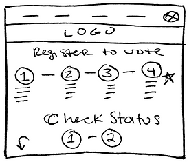
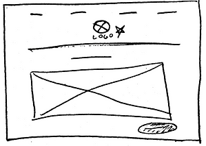
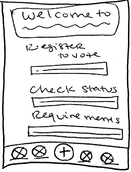
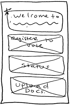
Constructing multiple iterations of each screen on paper, helped create key ideas that were included into the digital wireframes to help reduce user pain points.
For instance, I created a navigation banner at the top of each screen so users can easily complete their task from any page within the website. As well as, I created a navigation banner at the top and bottom of each screen so users can easily complete their task from any page within the app.

Including the number of steps needed to complete the process along with the text underneath allows users to fully understand the process before they start.


Stars were used to mark the elements of each sketch that would be used in the initial digital wireframes.


Including big buttons allows users to easily begin the voter registration process without searching throughout the app on how to complete a task

Digital wireframes
When initiating the design process, I began to create the websites designs based upon user feedback to help advance the users flow. Which was also backed up through user research.
Including easy navigation was an important thing to include in the apps design along with making sure it included accessible language such as screen readers.
Low-fidelity Prototype
To prepare for usability testing, I created a low-fidelity prototype that connected the user flow of registering to vote and verifying their registration status.
Low-Fidelity Prototype (Mobile)


Low-FidelityPrototype
Screen size variations


Usability study: findings
I conducted two rounds of usability studies. What was discovered from the first usability study was used to help influence the designs from wireframes to mockups. The second study used a high-fidelity prototype and showed what specific parts of the mockups needed to be corrected.
Round 1 findings
-
Users want to edit their answers once completing their application
-
User wants to know how many steps it takes to fully complete their application
-
User want back and forth page navigation to easily complete a task
Round 2 findings
-
Use an accessible color theme
-
Remove bottom navigation buttons on app to remove clutter and confusion
-
Add a home navigation button on each page
Usability study parameters
1.
Study type:
Moderated usability study
2.
Location:
United States, Remote
3.
Participants:
5 Participants
4 women and 1 men between the ages 17 - 26
4.
Length:
1 hour
Sample Questions:
Can you please start the voter registration process and complete it?
Prompt 3 follow-up: Did anything confuse you while completing this task? Is there anything you would change? Anything you liked when completing this task?
Affinity Diagrams
Refining the design
Mockups
When starting the design phase, I began to create freely, but after conducting the first usability study, I added a drop down menu, so users did not spend too much deciding what text was appropriate to fill into the inbox. I also revised the the design of the buttons at the bottom of the page, so it was easier for users to decide between.
After the second usability study, I decided to change the style and imagery of the homepage due to color accessibility. The white against the light pink is a little difficult to read.. I also included a home and language button in the navigation bar for a smoother user flow.
High-fidelity prototype
The final high-fidelity prototype showed a smooth and user flow for finding an authentic travel agent and being able to plan a trip and submit a review.
View Unifye Prototypes:
High-Fidelity Prototype (Website)


Mockups
Screen size variations
Accessibility considerations
1.
Conduct research on how
successful the app is in reaching the goal to raise the amount of youth voters through voter
registration.
Conduct more user
research to determine any new areas of need. Add more educational
resources for users to learn about the positive outcomes of registering of voting.
2.
Iterate and adjust new designs within the app to help improve the user pain points, to create better app usability.
3.
Design System
Why did I choose these font, colors, and illustrations?
During the design process, I made sure to always consider how fonts, colors, and illustrations would come together to create a cohesive and visually compelling narrative. I selected the "Fraunces" font family for its modern, yet, fun and approachable style, which aligns well with the branding. The clean lines of Times New Roman complemented the Fraunces font to help communicate a sleek interface of the product showcased, enhancing readability and reinforcing brand identity. Paired with a vibrant color palette comprising shades of purple, blue, green, etc., the typography stood out while evoking feelings of optimism and reliability. Moreover, we strategically incorporated illustrations throughout the app/website to engage the audience visually and break up the text. These illustrations, characterized by their minimalist design and playful aesthetic, served as visual cues that reinforced key messages and facilitated comprehension. By harmonizing fonts, colors, and illustrations, it not only created an aesthetically pleasing product but also ensured that the design elements worked together to convey the essence of the brand and enhance the overall user experience.


Going forward
Impact:
Users shared that the app/website made voting registration seem like something they could actually do on their own in a quick manner.
What I learned:
I learned that even though the problem I was trying to solve was a big one, diligently going through each step of the design process and
aligning with specific user needs helped me come up with solutions that were both feasible
and useful.
One quote from peer feedback:
" Unifye has found a way to make registering to vote, simple and easy. This would be useful for not just young people, but all people from different backgrounds.”
Next steps
1.
Conduct another round of usability studies to validate whether the pain points users experienced have been effectively addressed.
2.
Conduct more user research to determine any new areas of need.
3.
Iterate and adjust new designs within the app to help improve the user pain points, to create better app usability.


